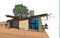
Notes On The Version 1.0 House
My first comments on the 1.0 design as shown in the 3D CAD view are
- We would like to extend the deck around most of the
south side of the house, rather than have separate decks. - Currently the glass goes straight up, flush against the inside edge of
the angled columns. We would like to push the glass out at least
half a column to form recessed nooks for reading couches on the inside.
It could, in fact be an angled pane of glass, parallel to the outside slanted edge
of the stone column. This would create a much stronger sense of separate
“living centers” as Christopher Alexander would say. It also createst a
stronger definition for Gigi’s studio on the southwest corner of the house. For the
same reason, we also would not want the glass to go all the way to the outside
edge, but allow the column to form recessed area on the deck. - The tall windows are beautiful, but at present it almost feels like too
much exposure. We’d like to keep the “lean-to” style of the southern part
of the house, but would like to think of a way to someway provide more
deep shade /privacy for the deck that would now extend around the south.
One possibility that has occurred to me for item #3 is to add a set of hinged
“eaves” to the upward-sloping roof, that when deployed drop down from the
roof edge, parallel to the outside column line. Here is a sketch of the idea:
Another idea for #3 that I’m no longer enthusiastic about was to add a
downward sloping roof on part of the house, forming a sort of clerestory
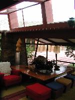
window in between. Here is an example from an interior of
Frank Lloyd Wright’s Taliesin West House
(taken on the roadtrip following our wedding in Sedona):
Note the tilting window and that the downward-sloping roof forms a space
for a clerestory window at the top. Kind of a neat effect, I think. You can
even see a strong resemblance to the stone column of the Taliesin room
and our columns. If you were to move the lower roof up about a foot or two
it would still provide a nice framing for the moutain views, but still creating
a much more sheltered feel for the deck.
I don’t like this approach as much as the “deployable eave” concept, because
it destroys Ray’s roof line, which I like, and requires a lot more engineering
to support that big second roof. The eaves idea doesn’t tweak the structure
at all, and is simple.


