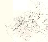
Bubble Diagram Version Zero
This is a first attempt to get down on paper a bubble diagram of all the stuff that
we want to go into the house (click to enlarge):
Clearly this thing needs work. There is a sort of clam-shell appearance right now, which
comes from the vague idea that we want to take advantage of the panoramic views in
the south-facing direction, and that we are on a slight slope heading south, towards
the bottom of the page. Consequently, the bubbles at the top of the page are not actually
at the same level as the lower ones, but about a half or quarter of a floor up.


that’s a lot bigger than i was expecting.
The CC & R’s of the property require that the minimum size of the
primary residence be not less than 1800 square feet. This was about
300 square feet more than we had planned, but the developer is pretty
firm about it, as small houses adversely affect the property values of
the surrounding lots.
I like the layout. It is exactly as I envisioned it when Gigi and I talked. (the master, living, dining and kitchen are just as I imagined) Isn’t that weird?
Is that the jacuzzi outside the master? I can’t quite tell. If so, I think that is where is should be – not in the center of the deck.
Kitchen – I think a curved countertop facing out would be cool. The curve would match the outside curve of the house. I think it should be wide enough for there to be chairs on the other side. That way, people can sit, talk and drink wine while Niles cooks.(teehee)
I agree with Eric that the dining area seems a little big. If you aren’t planning on having really big gatherings of people, I think it could be slightly smaller and the living bigger. The living could have several seating areas. I know the window seats are there, but I mean a few grouping of furniture. I think they are referred to as intimate seating areas.
If you want to have a big dining area, I think a really big circular table could look really cool. Rough looking, of course.