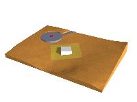
The 1.1 design proposal

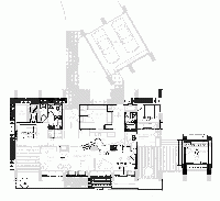
The changes to the 1.0 floorplan are in dark overlay over the original diagram:

1.1 proposal

May be described as follows:

1. Move tall windows out halfway along columns, also making them
slant parallel to the outside slant of the column. This
creates 3′ recessed areas inside for reading nooks,
dining nooks, etc. If slanting them is structurally difficult
or expensive, leave vertical but push out the top of window to the
very outside edge of top of column. It also allows for the bottom
portion of the wall to be material other than glass.

2. expand deck along entire south-facing side. Move jacuzzi from
fenced patio to southwest corner of deck.

3. Move the doors leading to outside deck over to the next set of
windows on the right (east).

4. Shorten Guest bedroom to 12′ square and move up (north)
flush with front. Entrance to it will now be on the
northwest corner.

5. Put windows on both south and east facing walls of guest room.

6. Move the guest bathroom down (south) approx. 3-4 feet, forming
a small hallway leading to the guest room entrance. Flip the bathroom
floorplan vertically, and place the bathroom entrance so that
it is in the little hallway connecting to the guest room.

7. Move french doors on south-eastern wall down approx 3 feet,
and extend wall north to intersect the bathroom.

8. Place dual sink/counter against this new eastern wall, and
place window over the pair of sinks.

9. Orient Fireplace so that it is facing south-east, diagonally
into great room.

10. flip the range/counter horizontally, move it towards the
eastern side, and bend the curved edge more towards 60 degrees.
Curve the stairs up 30 degrees to meet the end at right angles.

11. Eliminate central sink/storage island.

12. Eliminate entryway coat-closet. We will never use them. Use
space to fill out utility room.

13. Push south wall of utility room 3 feet further south.

14. Move fridge to South-eastern corner of utility room, facing
into kitchen.

15. Recess the eastern wall of Utility room, to allow placement
of pantry shelves into wall along eastern side of wall.

16. Eliminate closet next to the secondary entrance. leave open
for hanging boots, hiking poles etc.

17. Move Jean’s desk over to recessed south window, facing view.

18. Move northeastern column up, aligned with the others in front.

19. Place window on western wall of master bedroom.

20. Move jacuzzi to south-western corner of deck.

21. Reshape master bathroom from 12×12 to an area shaped 10 x 14, removing 2′ of
space from north front and moving it to the western side.
Remove fenced patio and door in bathroom leading to it.
Refer to overlay showing how bathroom is now split into
a separate shower/bath/sink, and toilet-sink combination,
with a joined walk-in closet.

22. Remove bidet and one of the sinks in master bathroom. Use
the extra space to form a walk-in closet on the eastern edge
of bathroom space.

23. Remove closet from master bedroom, and move eastern wall of
master bedroom so that it is flush with the current location
of the bedroom doorway.

24. Move observatory slightly north so that the roof may slide
into (now larger) courtyard, without colliding with the stone
columns. Note: Observatory may have to be taller than currently,
so that the house roofline does not block the western view of
scope.

Notes On The Version 1.0 House

My first comments on the 1.0 design as shown in the 3D CAD view are

  1. We would like to extend the deck around most of the
    south side of the house, rather than have separate decks.
  2. Currently the glass goes straight up, flush against the inside edge of
    the angled columns. We would like to push the glass out at least
    half a column to form recessed nooks for reading couches on the inside.
    It could, in fact be an angled pane of glass, parallel to the outside slanted edge
    of the stone column. This would create a much stronger sense of separate
    “living centers” as Christopher Alexander would say. It also createst a
    stronger definition for Gigi’s studio on the southwest corner of the house. For the
    same reason, we also would not want the glass to go all the way to the outside
    edge, but allow the column to form recessed area on the deck.
  3. The tall windows are beautiful, but at present it almost feels like too
    much exposure. We’d like to keep the “lean-to” style of the southern part
    of the house, but would like to think of a way to someway provide more
    deep shade /privacy for the deck that would now extend around the south.

One possibility that has occurred to me for item #3 is to add a set of hinged
“eaves” to the upward-sloping roof, that when deployed drop down from the
roof edge, parallel to the outside column line. Here is a sketch of the idea:

Another idea for #3 that I’m no longer enthusiastic about was to add a
downward sloping roof on part of the house, forming a sort of clerestory
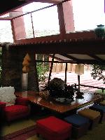
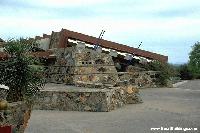
window in between. Here is an example from an interior of
Frank Lloyd Wright’s Taliesin West House
(taken on the roadtrip following our wedding in Sedona):

taliesin west clerestory window

Note the tilting window and that the downward-sloping roof forms a space
for a clerestory window at the top. Kind of a neat effect, I think. You can
even see a strong resemblance to the stone column of the Taliesin room
and our columns. If you were to move the lower roof up about a foot or two
it would still provide a nice framing for the moutain views, but still creating
a much more sheltered feel for the deck.

I don’t like this approach as much as the “deployable eave” concept, because
it destroys Ray’s roof line, which I like, and requires a lot more engineering
to support that big second roof. The eaves idea doesn’t tweak the structure
at all, and is simple.

Solid Model CAD Pics of House

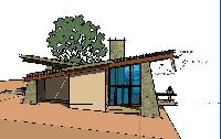
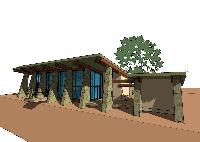
Ray Gardner just sent us some screenshots of a 3D CAD model
of the current (version 1.0) floorplan
(click to enlarge):

He also sent us the actual SKP format cad file that you can look at, walk-through etc
using a free Viewer. You can either download it directly from Sketchup.com
(they want your email address and blood type etc), or else here are the free viewer
installers I already downloaded for Windows and Mac OS X (Classic macs and linux systems are out of luck).

Looking at the 3D cad model and spinning it around has already helped us figure out some
of the things we need to change. By the way, don’t take the size of the people in the
model too seriously for a sense of vertical scale: we’ve figured out that at this scale those people are almost 7 feet tall !

Bubble Diagram Version One

We met with Ray Gardner on Monday and worked out our first real bubble diagrams.
Here is what we came up with (south is down):

bubble1

(click to enlarge)

The interesting thing about this is that it is very similar to the “version zero” diagram, in spite of
the fact that this one was drawn freehand by Ray, and we did not show him the first diagram, nor
did we tell him where to put things. All he did was ask a few questions, and the thing just unfolded
from his own knowledge about views, light, room placement and the like.

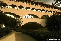
Marin Courthouse

I’ve never really liked these things that Frank Lloyd Wright did
that have all the circles in them. It’s pretty in an abstract sort of
way, but I wouldn’t want to live there:

One of the things that Christopher Alexander says about all this is that the
architect allowed an abstract image or idea take precedence over the life
of the site, and the people that were to be using it. In Wright’s case, he was
at war with “The Box” at the time, and using circles seemed like a good idea
at the time. It just doesn’t look like a friendly place to sit around in and read
a book.

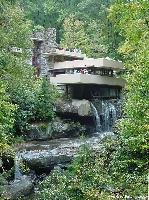
Fallingwater

Another one we like is Fallingwater. This place seems very alive, and appears to grow out of the site, made out of the same rock and earth (click to enlarge). The horizontal planes and vertical stone walls look like features that would fit well in our own site.

We’ve heard that the engineering in the place was faulty, however, and there have been some heroic efforts lately to keep the cantilevered concrete slabs in one piece. The lesson there is to know your materials, and to not sacrifice good structural integrity to artistic imagery.

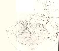
Bubble Diagram Version Zero

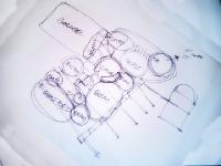
This is a first attempt to get down on paper a bubble diagram of all the stuff that
we want to go into the house (click to enlarge):

bubble diagram

Clearly this thing needs work. There is a sort of clam-shell appearance right now, which
comes from the vague idea that we want to take advantage of the panoramic views in
the south-facing direction, and that we are on a slight slope heading south, towards
the bottom of the page. Consequently, the bubbles at the top of the page are not actually
at the same level as the lower ones, but about a half or quarter of a floor up.

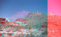
3D Anaglyph of Site

I took a couple of digital photos of the site and combined them
into a single red/blue (or red-cyan) color 3D anaglyph photos,
which you you view below (click to enlarge):

If you look closely, you can see Gigi and Ray Gardner, our architect, in the middle
right portion of the picture. This gives you a sense of the scale.
If you do not have 3d red-blue or red-cyan glasses (JPL recommends cyan),
you can get a couple of pairs (or 50) from
here.

Our Wish List

Wish List: (aka Ask for the Moon, and maybe you’ll get half):

  • Serene
    Ideally, when walking into the house you should feel a sense of relaxing, of coming home, the pressure off. Here is where you can be yourself and enjoy life.
  • Beautiful:
    Rustic beauty. Should come from the natural way that it expresses the life of the people that live in it, and not from any preconceived notion of “style”.
  • Stone, Glass and Wood.
    Niles grew up with stucco. That was enough. We see stone floors, lots of glass for the views of Zion, and some interior and exterior wood accents, such as cedar, which is common in the area.
  • Books, Books, Books:
    We read. A lot. Bookshelves by the kitchen for cookbooks, bookshelves underneath window-seats for something to read while
    enjoying the view, bookshelves in the bedroom.
  • The Deck:
    Barbeque on one side, Jacuzzi on the other. The deck is at least partly covered by a long shading roof extending out from the great room. At one place along the shaded part of the deck, there should be at least hooks for a hammock. Another possibility is to have a mist generator on the eaves for hot days, which are many.

  • Views and Light:
    Our lot has almost 360 degree views. We see the deck growing out of the Navaho sandstone with a south-facing view, skylights.
  • Great Room:
    Old houses have all these claustrophobic little boxes called formal dining rooms. We do our own cooking and would like to see and talk to people while we’re cooking. Ideally, it will open out to the deck with the view. The kitchen will have an island which will have the main burners, with suspended hangers for various pots and pans.
  • Master Bedroom with fireplace:
    ideally the fireplace is shared in the stone wall between the bedroom and the great room.
  • Guest Room / library:
    We should be able to accomodate one couple and their kids.
  • Entertainment area
    Occasionally we watch TV or DVD movies. We admit it. Never during the day, though so the best thing would be to have a suspended projection TV with a screen that retracts. Probably can be integrated with the great room.
  • Observatory:
    Nothing fancy. It is probably a good idea to have a simple base on the hard bedrock to avoid vibration of the telescope, with some kind of retractable cover. Could be integrated with the separated studio by the garage.
  • Studio:
    A studio for getting away and studying, reading, writing and what not. A place for Gigi to get away and read, such as a loft.
  • Storage Room / Pantry/ Cellar
    A place to store long-term food, wine and the like. Ideally it would be in an earth-cooled cellar.
  • Laundry/Utility/Mud Room:
    With shower, allowing you to come in after hiking the Zion narrows and not get
    the rest of the house muddied up.

Christopher Alexander

Started reading Christopher Alexander’s The Nature of Order,
in which the architect/philosopher describes his ideas about what makes
a (building | place | town | anything) alive in a real sense. I have found it
to be very illuminating, and in particular it has helped me understand why I very
much like some of Frank Lloyd Wright’s work, but not others.

Alexander is the founder of the “pattern” concept in architecture, which has gone on to
be used (or misused) in software development, design processes, and even dating. He
has catalogued dozens of patterns that may be used to solve a particular problem, in
such a way that has been found to enhance the “living” nature of the place. For example,
the pattern “ROOMS LIT ON TWO SIDES”, Alexander observes that you should design
rooms so that at least two sides have light coming in, to accomodate the movement of the
sun and avoid having the room too dark at any one time of the day.

In one of his earlier works, The Timeless Way of Building, Alexander
talks about “The Quality That Has No Name”, that refers to any building or place,
in which you feel more alive.

The Beginning of the Search


There’s a green one and a pink one
And a blue one and a yellow one
And they’re all made out of ticky-tacky
And they all look just the same

— “Little Boxes” Words and music by Malvina Reynolds.

I had just gotten back from a business trip when Gigi announced that
she had “made a decision”, as she is known to do. She had decided that
we should look into taking a trip out to Utah to see about buying or building
a get-away home.

It made perfect sense to me. We had been spending the last two years exploring the
borderline psychotic world that the inhabitants call “Southern California Real Estate”,
with its $700,000.00 closets and garish MacMansions. We have often wondered just
what the hell all the people that can afford these things actually do.

The simple fact is that we can’t afford to buy our first home here, so following simple
Alice-in-Wonderland logic, we might as well start out by buying our second home first,
and then working our way up to a first home.

–Niles

1 2 3