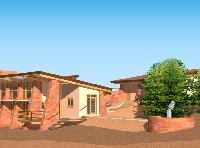
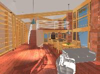
4.2 Plan Revision

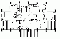
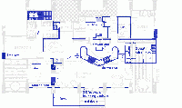
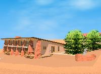
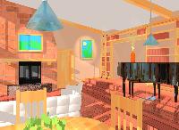
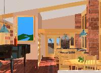
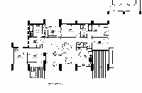
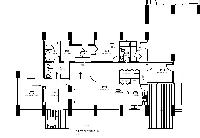
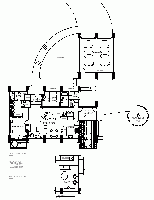
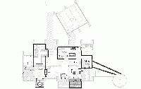
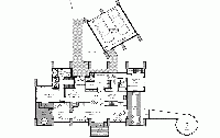
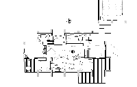
Here is a new PDF of the latest 4.2 plans. And here is a quick snapshot of the plans:

The main differences in this plan are that we have moved the central deck over to the
eastern deck, along with the exit door. Also, Ray wanted to make the kitchen counter
more centered with the roof beams, and so has moved it about 3 feet to the west. In
the process, he has also moved out the wall to my office an equal amount, creating
a space in the northwest corner of the southwest room that can be used for the
soundsystem components. This goes along with our intent that the southwest corner
will be used for the TV, music etc center.

The new plans are not as symmetrical as the previous design, but we think this
placement of the deck is a practical improvement on the views and usage.

There is also an extension to the kitchen counter, for use by people at the level
of the great room. Not sure if we like this or not.

4.0 Proposal

After our Thanksgiving dinner, we re-thunk our plans and realized we like the earlier
plans a lot more. So we spent some time working out what we liked about the later plans
and tried to integrate them into the earlier (2.0) plan. Here is what we came up with:

NB: If you notice some things changed from the last time you looked, its because I upgraded
my home system from linux Fedora Core 2 to Core 3 this weekend (12/4/04), and in the process
blew away some data files. It happens. This is from a backup from a few days ago.

A Setback

Turns out that the Springdale folks have changed the rules about
“high impact” lots in the town, and our site now falls under that
definition. This requires that our house be no more than 20 feet
high at any point, and that is two feet over our current plan.

Looks like we will have to move the loft back down to the ground
floor and think a lot more about how to make this all work.

Bummer.

Third Time’s the Charm

Here is the latest (3.0 if anyone’s counting) version of the floorplan
(click to enlarge):

That is just a screen-capture. Here is the full PDF formatted plan. Note the Gigi Loft, and the ladder for those hard-to-reach books way up there on the shelves (the ladder is only obvious in the pdf version).

Okay, so the things we want to change with this version are…

Hmm.

Pretty much nothing. This is very cool.

…okay I guess we’re done then.

Amazing how much this stayed in the spirit of our Version Zero bubble diagram.

Version 2.2 Loft Concept

Here are a few sketches we’ve sent Ray on the Loft, the bedroom fireplace,
and so on. This first one is an overlay of the floorplan mods:

This is still not quite right, but a lot closer. The north wall of the bedroom needs to be moved up to
increase the size of the bedroom, and we want to re-open the pathway through the washer / pantry
area to have a direct route to the kitchen. Also, Gigi suggested that if we place the secondary entrance
over on the eastern side of the house, that opens up the north corner of the house as a good place to
put the water heater room, currently next to the wash area. This would then allow the pantry area to
be increased.

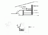
This second one is a view of the loft area, together with an elevation view:

I’m not sure about this either. I think actually the post should go on the left side of the kitchen
entryway to hold up that side of the walkway across to the loft. Anyway, we’ll see what Ray does
with that.

Ideas for plan 2.1

Here is a sketch of possible changes (see below)

We are looking at the “Second Try” layout and trying to figure out
how to address some of the things we are still not settled on. In
some ways we like some of the “First Try” features better, but
also know that won’t work. We’ve been looking at some designs of
“cabin” interiors that we like and have come up with some general
goals. Above is a vague sketch of how it should go, but we do not
have to go with it if someone comes up with something that works or
feels better.

Goals for next try:

1. Reduce Footprint to 1800

2. Create fireplace for master bedroom, possibly by
rotating bedroom down into Jean’s Room and sharing
same FP as great room from opposite side. Bedroom
will now open right out onto main deck, and jacuzzi
should be moved over, as the two leftmost columns
will now disappear.

3. Move sinks and kitchen down to current location
of nook. (the range / counter will have to be rotated
90 degrees to fit).

4. Move Jean’s space to a loft over Kitchen

5. Move Utility room down to former location of
kitchen.

6. Change “Guest” room to “Niles Study”, and move it
south 12 feet. It can be made smaller, 10′ square
or so, windows facing south. Place an exit out the
east side of study, with a ramp to allow rolling the telescope
out to pad.

7. Take former space occupied by Utility room and
turn it into (smaller) guest room. The bathroom does
not necessarily have to be attached to it, but if you
flip the current bathroom and the secondary entrance
hallway it should work.

Only 7 changes! That’s a lot better than the first time around. There is
hope yet…

The Ritter Block

The word going around is, my Dad’s Aunt Eunice has finally found some
prime samples of “Ritter Block”, which is a sort of concrete block that was
invented by my great-grandfather, George Ritter. George was in the concrete
and marble/tile business in Pinckneyville, Illinois, and his “Ritter Block” was
used in many buildings throughout that part of Illinois.

The plot had been hatched in my mind some time ago that a novel tribute to
my inventive ancestor would be to obtain one of his blocks and use it as a
cornerstone for the house we are building.

Here is an old picture of George Ritter with one of his other inventions, a
new jack for automobiles:

The Unbearable Lightness of Building

Slice-o-Life Department:

It was not my most ambitious meal, but I was really happy with the
way the sauce came out. After sauteing the onions and mushrooms
in butter, deglazing with white wine, then adding the fresh chopped
tarragon and vegetable stock, this formed the base of a subtle but aromatic
cream sauce for the pan-seared salmon steaks, resting on a bed of
mushroom risotto (with a little extra cognac to kick it up a notch).

And Gigi was just sitting there, absently poking at it with her fork.

This was right out of a gender-bent 50’s melodrama. I was ready to stand up, rip
the metaphorical apron off and plaintively wail in a fake Cary Grant accent,
“dahling, where has the magic gone ?”

It turns out that

  1. The fish had bones in it (of which she has been scared since Julie swallowed one years ago).
  2. She was thinking about how to completely re-arrange all the rooms in the house design
    to solve some long-standing issues with the current plan.

Good news all around. I had not known about issue #1, but I thought I was the only one waking
up at 3am with brooding thoughts about loft design, light, stone vs. wood, and
soils compaction tests.

The only trouble is, her ideas mean going back a few steps and redoing part of the process I
thought we had finished with. Frustrating. But I have to admit, they open up ways to make
the overall plan cleaner and simpler, with a smaller footprint, but more interesting internal
design and structure that comes closer to what we had in mind originally. Stay tuned.

Next time, I’ll be sure to get the fish filets without the bones in them.

Floorplan Version 2.0

Here is a snapshot of our latest floorplan (click to enlarge):

You can also download the scalable PDF version here.

You will notice that most of our change requests were implemented. In addition, the
observatory was redesigned as a circular platform, and moved away from the main house to
avoid the line-of-sight interference and thermal effects that interfere with astro-photography.
When the telescope is not up, it can double as a picnic area or gazebo.

Sketch of Roof brim and Railing

Here is a sketch of one possible way to implement the leading edge “brim” of the
roof that can be deployed or retracted depending on the amount of shade
and the angle of the sun:

There is also a sketch of some build-in seats that could be put on the inside edges of
some of the columns on the deck. The railing can have small concrete posts that
match the columns in shape, though perhaps flipped or made symmetrical. I see these
railings as being low, about 2-3 feet.

1 2 3